Welcome to La Magazine
Stories that earn a slower kind of attention
La Magazine is a United Kingdom digital publication for readers who still like language, context and a finished thought. This home page is not a shelf of dummy headlines. It is a proper entrance to a living archive — your real categories, your real posts, set in a calm, centred frame.
The magazine
A centred home for writing that still takes its time
Premium, on this site, does not mean noise. It means balance, white space, a masthead you can actually read, and copy placed on the centre line of the page so the eye knows where to rest.
Most homepages now behave like shop windows after a sale: everything pulled to one side, too many colours, too many invented titles, and a line of type that runs so wide the reader loses the beginning of the next sentence. La Magazine is built against that habit. The maroon bar at the top is a masthead, not a banner farm. The pages sit in the middle. Search sits to the right. The name of the title sits to the left. And the writing on this page is held in a centred column, the way a well-printed periodical holds a column — not stretched to the edges of a monitor, and not hiding in a sidebar.
That decision is aesthetic and ethical at once. A centred heading tells you the page has been composed. A centred measure of type tells you someone thought about your eyes. We keep body text dark on a cream or white field. In the header and footer every word is solid white. Links are white. Hover states stay white, with a clear underline. Buttons on the dark hero are white with maroon lettering, so they pass a contrast check in daylight and at night. Luxury that cannot be read is only costume.
We also refuse the other costume of the modern web: the dummy article. If a card appears below, it is a post that already exists in WordPress. If a category appears, it is a category in use. The home page is wired to the archive so that publishing a new piece is enough. You do not need a second, fictional magazine to make the shelves look full. Honesty is part of the finish.
La Magazine belongs to a British strain of reading that values understatement without becoming vague. We prefer a precise verb to a loud adjective. We prefer a finished paragraph to a carousel. We assume the person who arrived here has a life beyond the screen and chose this tab on purpose. That assumption changes the design. It removes the fake urgency. It also removes the sneer. Equality is a better style guide than either.
Written to be read
Full articles, not bait.
Live from the archive
Your real posts, listed here.
True categories
The sections you already use.
Reader first
Clear type, calm layout.
A longer introduction
How we think about a magazine in a hurried century
If you only needed a list of links, you would not still be here. What follows is the character of the title: why it exists, how we edit, and what you can expect when you move from this centred page into the blog.
A magazine used to mean a room you could walk around in. You knew the furniture. You recognised the voice. You could disagree with it and still come back next week because the disagreement felt adult. Digital publishing quietly replaced that room with a corridor of doors, each one shouting. La Magazine is an attempt to rebuild the room. The maroon masthead, the white lettering, the measured column of type — these are not decorations for their own sake. They are a way of saying: sit down, this will take a few minutes, and those minutes will be used well.
We start from a plain belief. People are not tired of reading. They are tired of being managed while they read. They are tired of pop-ups, of false urgency, of articles that open with a promise and dissolve into repetition. They are tired of home pages that showcase imaginary posts because nobody wanted to wire the page to the actual archive. That last point matters here. Your magazine already has work in it. The honest thing is to show that work, then write enough around it that a first-time visitor understands the standard you are trying to keep.
Standards sound grand until they are translated into daily choices. A standard is the decision to keep a paragraph that is difficult rather than replace it with a bullet list that explains nothing. A standard is the decision to name a category accurately, even if a vaguer name might attract a wider click. A standard is the decision to send the search box to WordPress search so a visitor can find a page or a post without guessing your menu. A standard is white text on a dark maroon bar that can actually be read in daylight, not grey vapour that looks “premium” in a mock-up and fails a contrast check in the real world.
Contrast is not a technical nicety. It is hospitality. If the lettering in the header dissolves into the background, you have told a portion of your readers that they were not pictured when the page was designed. The same is true of tiny gold captions on maroon, of pale footer links, of placeholder text that looks like a whisper. On La Magazine the masthead and the footer speak in solid white. Primary actions on maroon are white buttons with dark maroon words. That is what a premium finish should mean: finish that includes everyone who arrived.
The same hospitality applies to width and to centre. A line of type that stretches from edge to edge on a large monitor is not luxurious; it is tiring. This layout is capped so the eye can travel without losing the start of the next line. Headings sit on the centre axis. Introductions sit on the centre axis. Cards live in a centred grid. On a telephone the menu collapses into a proper button large enough to hit with a thumb. These are quiet decisions. They are also the difference between a page that feels designed and a page that merely feels decorated.
What, then, do we publish? Whatever the magazine’s categories already hold — and whatever they will hold next. Some readers will come for practical writing: money, work, the unglamorous machinery of a week. Some will come for culture, for the essay that does not apologise for taking its time. Some will come for technology explained without contempt for the beginner or for the expert. The home page does not need to predict every future article. It needs to promise a method. We read before we write. We prefer a precise verb. We do not invent experts. We do not dress marketing copy as a dispatch from the world.
There is a craft to the first screen of a magazine and a craft to the fiftieth paragraph. The first screen must be unmistakable. You should know the title, the country, and the offer. The later paragraphs must still be doing work. If you have read this far, you already know whether the voice suits you. That is useful. Magazines are not for everyone, and they should not pretend to be. They are for the people who want this particular mix of seriousness and warmth, of structure and surprise. La Magazine is for the reader who will forgive a long page if the page was built with care, and who will not forgive a short page that wasted their time.
Care, in practice, looks like editing. It looks like cutting a clever line that does not tell the truth. It looks like checking that a category archive contains what the category name claims. It looks like using the search form in the header so that “privacy policy” and a half-remembered article title are equally findable. It looks like a footer that repeats the important doors — About, Contact, Disclaimer, Privacy, Terms — because a reader who has reached the bottom of a long home page should not be punished with a maze.
We also believe a home page may still be a place for argument. Not party argument. Argument in the older sense: a case, made in order. The case for La Magazine is that attention is scarce and therefore valuable, that valuable attention deserves complete sentences, and that a site which already has posts should lead with those posts. Dummy content trains a team to accept unreality. Live content trains a team to keep the archive worthy of the masthead. That is the discipline this page is here to enforce, politely and in public.
If you are a returning reader, treat this essay as a hallway you can walk through quickly. The live articles are further down, still centred, still drawn from the blog. If you are new, stay a little longer. The next sections explain how the categories work, how we choose what to feature, and how to use the magazine so it becomes a habit rather than a tab you lose. Then the page gets out of the way and lets the writing you have already published do what writing is for.
Browse topics
Explore the categories already at work on the site
These are not sample sections. They are your real WordPress categories, ordered by the writing they already hold. Every heading on this page is centred. Every card sits in a centred grid. Follow any one into its archive.
Fashion
Read the published articles filed under this heading in the La Magazine archive.
370 articles →Business
Read the published articles filed under this heading in the La Magazine archive.
243 articles →LifeStyle
Read the published articles filed under this heading in the La Magazine archive.
208 articles →Education
Read the published articles filed under this heading in the La Magazine archive.
175 articles →Health
Read the published articles filed under this heading in the La Magazine archive.
169 articles →Finance
Read the published articles filed under this heading in the La Magazine archive.
103 articles →Celebrities
Read the published articles filed under this heading in the La Magazine archive.
103 articles →Home Improvement
Read the published articles filed under this heading in the La Magazine archive.
58 articles →Categories are a promise about filing. When a reader chooses a health heading, they should not fall into a heap of unrelated notes. When they choose a business heading, they should find pieces that respect the intelligence of someone who already has a job and a calendar. We keep the names plain on purpose. Plain names age better than clever ones. They also search better. If you are looking for a subject we cover, the search bar in the header will look through posts and pages together. If you would rather wander, the cards above are the map.
A good category system is a kind of hospitality too. It lets a hurried visitor skip the manifesto and still find a door. It lets a loyal visitor see how the magazine is growing. Count the articles on a card and you are looking at work already done, not at a target on a marketing slide. As new posts go live, they appear in their category and, when they are recent enough, they rise into the featured and latest areas on this page. You do not need to edit dummy titles. Publish, and the home page keeps step.
From the archive
Featured reading from La Magazine
The articles below are live posts from your blog, starting with the most recent. Titles, excerpts and images are pulled from WordPress. Open any heading to read the full piece.
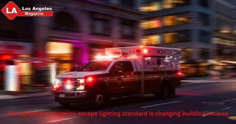
The updated emergency escape lighting standard is changing building reviews
Emergency lighting is often noticed only during a power cut or scheduled test. For facilities teams, however, the standards behind it continue to develop. BS EN 50172:2024 replaced…
Read article →
The Expanding Role of Cybersecurity Leaders in AI Driven Enterprises
AI is becoming part of daily business work. Companies use AI tools for customer support, data analysis, content work, automation, security alerts, hiring support, and many other tasks.…
Read article →
Two Sleek Used 30m Superyachts for Sale with TWW Yachts
For many, the 30-metre yacht category is the sweet spot in ownership. Yachts in the category offer the full superyacht experience, with the agility, manoeuvrability and efficiency of…
Read article →
Ensuring a Fragrant Experience: The Journey of Perfume
The art of fragrance has found a vibrant home in the city-state, creating a rich tapestry of olfactory experiences. Whether you’re exploring the bustling streets or the serenity…
Read article →
Elevate Your Gaming Experience with the Ultimate Seating
In the realm of gaming, the right equipment can significantly enhance performance, enjoyment, and health. Central to this setup is selecting the best gaming chair, a piece of…
Read article →Editorial method
What we refuse, and what we keep
Every independent title eventually has to decide what it will not do. These three commitments sit at the centre of the page because they sit at the centre of the work.
Depth before noise
We would rather publish a smaller number of complete articles than a daily drizzle of notes that say nothing twice. Depth is not length for its own sake. It is the feeling that the writer stayed with the subject until the easy claims had been used up and the true ones remained.
Claims that can be checked
Where we describe a study, a law, a product or a history, we keep the language responsible. Uncertainty is not a weakness; it is a form of accuracy. Readers can tell when a magazine is bluffing. They can also tell when a magazine is being careful. We prefer the second reputation.
A human pace
The page is built to be read on a sofa, on a train, or at a desk between meetings. Type is dark on a light field. Buttons are large enough to use. Nothing essential is hidden in pale grey. A magazine that cannot be read by tired eyes is not a magazine. It is a poster.
We will not invent comments from imaginary readers. We will not park fake articles on the home page to make the shelves look full. We will not use colour combinations that look rich in a brand deck and fail in the browser. We will not trap people in a carousel that auto-advances while they are trying to think. We will not ask for an email address without a clear next step. The box on this page sends you to Contact, where a real message can be written to a real address.
What we will do is keep the masthead stable. The same header travels with you to About, Blog, Contact, Disclaimer, Privacy and Terms, and it travels with you into individual posts. The same footer waits at the bottom, in the same maroon, with the same white words. That repetition is not a lack of imagination. It is how a title becomes recognisable. You should be able to land on any URL under lamagazine.co.uk and know, before the first sentence, that you are still inside the same house.
Inside the house, tone can vary. A practical guide may be brisk. An essay may wander and then gather itself. A cultural piece may allow a joke. What does not vary is the expectation that the reader is an equal. We do not over-explain the obvious. We do not under-explain the difficult. There is a British strain of magazine writing that values understatement without becoming vague. We aim at that strain. It means preferring “this is likely” to “this will change everything”. It means letting a headline describe the article rather than tease it.
It also means keeping legal doors easy to find. Privacy, terms and the disclaimer are not embarrassing extras; they are part of treating readers as adults. They sit in the middle of the header and again in the footer, in white, on maroon, with no trick contrast. If you need to know how the site works, you should not have to hunt. If you need to write to us, the address is contact@lamagazine.co.uk, and the Contact page is a first-class citizen of the menu rather than an afterthought in six-point type.
Using the magazine
How to make La Magazine part of a week rather than a moment
A homepage can be a spectacle or a habit. We prefer the second. Habits are built from repeatable moves, all of them visible from the centre of this page.
Start with search when you know your subject. The field in the header looks across posts and pages. Type a topic, a half-remembered headline, or the name of a legal page. You should not have to remember our information architecture in order to use it. Search is the shortest distance between a question and a piece of writing.
Start with categories when you are browsing. The category cards on this page are the same taxonomy that organises the blog. They will grow as you publish. If a section is empty one month and busy the next, that is the magazine breathing, not a design error. Return to a category you trust and read the next article as you would the next piece in a paper you already like.
Start with the latest list when you want the current temperature of the title. The featured block and the later list are both fed from published posts. As soon as you add a new article in WordPress, it is eligible to appear here. There is no separate “dummy magazine” to keep in sync. The live archive is the magazine.
Read in the medium that suits the hour. The layout is comfortable on a wide laptop and on a small phone. Headings remain centred so the page does not feel like a document that slid left. The header stays at hand so you can move without scrolling back through a thousand words. The back-to-top control appears only after you have actually gone down the page, and it is a button large enough to use. These are small courtesies. Over a year of reading they add up to a feeling that the site is on your side.
If a piece helps you, take it with you in the old way: send the URL to someone who would care, or keep it in your own archive of bookmarks. We do not need to manufacture virality for a sentence to be worth keeping. Some of the most useful magazine articles in any era were the ones that travelled quietly from one person to another because they were accurate and well made. That is still a decent distribution strategy. It has the advantage of being honest.
Writers and editors who work on La Magazine should use this home page as a mirror. If the featured titles look thin, the answer is not to invent better titles for imaginary posts. The answer is to write better posts. If the categories look unbalanced, the answer is to commission or file more work where the magazine is hungry. The page will not lie to protect a mood. It will show what exists. That is one of the reasons it is long. A long, truthful home page is harder to hide behind than a short, glossy one.
Readers who work elsewhere — in classrooms, in clinics, in shops, in studios, in offices that do not look like offices — are the reason any of this is worth doing. We do not assume you have unlimited leisure. We do assume that if you open a long article, you would like it to repay you. That repayment might be practical: a clearer way to think about money, sleep, software, travel, work. It might be cultural: a better sentence about a feeling you already had. It might be civic: a cleaner account of a change in the world you live in. Different categories, same obligation.
The obligation extends to tone in difficult subjects. Health writing should not frighten people into clicks. Money writing should not shame people who started late. Technology writing should not sneer at those who did not follow every launch. Culture writing should not treat taste as a moral exam. There is plenty of room for judgement — magazines are not press releases — but judgement without scorn is a skill, and it is one we intend to keep practising in public.
If you ever feel that a piece has missed that mark, write to us. The Contact page is there for disagreement as much as for praise. A magazine that cannot hear its readers will eventually hear only itself. We would rather be corrected than be sleek. Correction is a form of contrast too: dark ink, light paper, nothing hiding in the shadows between them.
Write to La Magazine
Questions, corrections and ideas for the magazine are welcome. Use the form on our contact page — it is a real door, not a dummy box.
The promise
What you can hold us to after you leave this page
By the time a home page reaches this depth, it should be willing to be quoted against itself. These are the promises La Magazine makes in ordinary language, set in the centre so they cannot be missed.
- The header and footer will remain readable: maroon ground, white lettering, no pale-on-pale links.
- Headings and introductions will sit on the centre line of the page, in a column built for reading.
- The home page will feature real posts from the blog, not sample headlines.
- Category doors will lead to category archives that already exist in WordPress.
- Search will search, including pages such as Privacy Policy and Terms.
- Legal pages will stay one click away from every screen.
- New writing will be edited as if someone might print it out and still respect it in the morning.
Those lines are not a slogan set. They are a checklist. If we break one of them, the break will be visible. A dummy article would break the third line. A low-contrast button would break the first. A footer that hides the disclaimer in grey would break the first and the sixth at once. Design is ethics with a typesetting tool. We intend to keep both in working order.
There will be weeks when the magazine is quieter and weeks when it is busy. Independent titles have seasons. What should not seasonally vanish is the sense that a mind is in charge. You should feel, even on a short visit, that choices were made: this colour, this width, this centred measure, this order of stories, this length of introduction. The opposite feeling is the feeling of a template that was never inhabited. La Magazine is inhabited. The maroon is a choice. The long essay on the home page is a choice. Wiring the cards to your actual posts is a choice. We made them so that you do not have to wonder whether anyone is at home.
If you have read the whole of this page, you have already given us more attention than most sites deserve. The decent response is to send you onward to writing that is not about the magazine, but about the world. Use the featured stories, the latest list, the category cards, or the blog link. Take the search box if you arrived with a question. Take the contact address if you arrived with a disagreement. And if you simply wanted to know whether La Magazine was a serious place to read, you now have an answer written at a length that matches the claim.
We will keep publishing. You can keep us honest by reading closely. That is the oldest contract in magazines, and still the best one we know.
More from the blog
Further recent articles
Continuing from the featured set, these are the next live posts in date order — still centred, still yours.

New York to Las Vegas: Ultimate USA Itinerary by Flamingo Travels
Dreaming of an unforgettable American holiday that combines iconic cities, scenic highways, entertainment capitals, and unforgettable experiences? A journey from New York to Las Vegas offers the perfect mix of culture, adventure, nightlife, and sightseeing. With…

Gia Olimp: A Modern Name Gaining Attention in the Digital Landscape
In today’s fast-moving digital world, certain names begin to appear across search engines, social media platforms, and online discussions, sparking curiosity among users worldwide. One such name that has recently drawn attention is “Gia Olimp.” While…

Betty Seinfeld: A Look Into the Life and Legacy of Jerry Seinfeld’s Mother
The name “Betty Seinfeld” often appears in public discussions connected to the world-famous comedian Jerry Seinfeld. While she is not a celebrity in the traditional sense, Betty Seinfeld holds a meaningful place in conversations about family…
Continue through the full blog
The lists on this page are only the front of the shop. The blog holds the complete, living archive of La Magazine.
Visit the blog