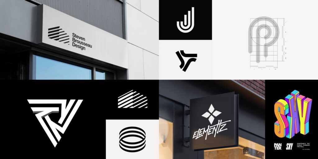
The phrase “create a logo” often conjures images of quick online generators or a few clicks in design software. While these tools have democratized access to basic visual branding, truly impactful logo design goes far beyond simple execution. It’s a strategic process that fuses artistic expression with business objectives, aiming to forge a timeless identifier that resonates deeply with your audience. This article delves into the often-underestimated strategic elements of how to create a logo that isn’t just aesthetically pleasing, but functionally powerful.
The Invisible Foundations: Strategy Precedes Design
Before a single pixel is placed or a line is drawn, the most successful logos are born from a robust strategic foundation. Skipping this crucial phase is akin to building a house without blueprints – you might get a structure, but it won’t be stable or fit for purpose.
1. The Archetypal Brand Persona: Who Are You, Really?
Forget demographics for a moment. Think about your brand as a person. What are their core values? Are they the wise sage, the playful jester, the heroic champion, the nurturing caregiver, or the rebellious outlaw? Understanding your brand’s archetype (or a blend of them) provides a powerful compass for visual language. For example, a “caregiver” brand might lean towards soft, approachable shapes and warm, inviting colors, while a “champion” brand would likely favor strong, dynamic forms and bold palettes. This deep dive into personality is rarely prompted by generic “create a logo” wizards, yet it’s fundamental to authenticity.
2. The Competitive “White Space”: Finding Your Visual Niche
Simply knowing your competitors isn’t enough. It’s about analyzing their visual language to identify white space – opportunities for visual distinction. If every competitor uses a blue, corporate-looking wordmark, leaning into a vibrant, abstract symbol or a unique hand-drawn typeface could be your differentiator. This isn’t about avoiding similarity entirely, but about finding a unique visual voice that stands out in the crowded market. A successful logo doesn’t just represent you; it positions you within your industry’s visual ecosystem.
3. The Future-Proof Filter: Enduring vs. Trending
When you set out to “create a logo,” it’s tempting to incorporate current design trends (e.g., gradients, specific geometric patterns, retro styles). While trends can add a contemporary feel, relying on them too heavily risks rapid obsolescence. A truly enduring logo possesses a timeless quality that transcends fleeting fads. This means opting for simplicity, versatility, and concepts that hold meaning beyond a particular era. The strategic filter here is to ask: “Will this logo still feel relevant and strong in 5, 10, or even 20 years?”
Beyond Templates: The Intentional Design Choices
Once the strategic groundwork is laid, the design phase becomes an act of informed decision-making rather than random selection.
1. Symbiotic Simplicity: More Than Just “Clean”
True simplicity in logo design isn’t about laziness; it’s about distillation. It’s removing every non-essential element until the core message shines through. This creates a logo that is:
- Memorable: Easier for the brain to process and recall.
- Versatile: Adapts effortlessly across all mediums, from a social media avatar to a building sign.
- Scalable: Looks crisp and legible at any size, from a tiny app icon to a large banner.
- Adaptable: Can be rendered in monochrome or reversed without losing its impact. This level of simplicity often comes from rigorous refinement, not from a basic template.
2. Typographic Personality: Voice Without Words
The chosen typeface for your logo communicates volumes about your brand’s personality, even before a single word is read. A sleek sans-serif whispers modernity, while a decorative script can convey elegance or tradition. The subtle nuances of kerning (space between letters), leading (space between lines), and weight all contribute to this silent narrative. When you “create a logo,” the typography isn’t just filler; it’s an integral character in your brand story.
3. The Color Code: Emotional Resonance and Industry Cues
Color theory is a powerful, often subconscious, driver of perception. The colors you choose for your logo can evoke specific emotions (e.g., red for passion, blue for trust, green for nature, yellow for optimism). They also carry industry cues – financial institutions often use blues, while eco-friendly brands lean into greens. A strategic color palette ensures your logo not only looks appealing but also communicates the right message and aligns with audience expectations while retaining a unique twist.
The Final Act: Application and Evolution
The process of how to “create a logo” doesn’t end with a final file. It extends into its application and potential evolution.
- Versatile Deliverables: A truly effective logo should come with a comprehensive set of file formats (vector: SVG, AI, EPS; raster: high-res PNG, JPG) to ensure it can be used everywhere, from print to digital. Transparent backgrounds (PNG) are essential for overlaying on different materials.
- Brand Guidelines: Even for a small business, a mini-brand guide documenting logo usage (correct colors, minimum size, clear space, forbidden alterations) ensures consistency across all touchpoints. This discipline builds brand recognition over time.
- The Test of Time: While trends change, a strategically crafted logo should possess an enduring quality. It should be able to evolve subtly over years, rather than requiring complete overhauls, preserving the hard-earned brand equity it has built.
In conclusion, to truly create a logo is to embark on a journey of self-discovery for your brand. It’s about making deliberate, informed choices at every stage, from understanding your core identity to meticulously refining every visual detail. It’s a strategic investment in your future, ensuring your brand’s first impression is a lasting one.


